When it comes to designing a great slide presentation, be forewarned: I have little creative or artistic ability. I have poor depth perception. I have no vision. I am not an artist. But I’ve used PowerPoint (and there are many excellent alternatives, like Prezi and Slide Rocket) hundreds of times to deliver mostly successful presentations. So I do have some thoughts to share on how to design the best presentation possible. Here are a few.
1. Keep it simple.
A few words. A few photos. No graphics that jump out at your audience, spin around or sing songs. Use the words on each slide as a memory jogger to make your point. If possible, avoid using any elements that need to download from the internet – like YouTube videos. It sounds cool and may work great at your office, but there’s a good chance that the wireless connection in your presentation space will be inferior, so if you’re relying on that video for your presentation you could be in big trouble. Your audience is there to hear you and not just look at your PowerPoint. No one comes to a presentation wondering what the speaker’s PowerPoint is going to look like.

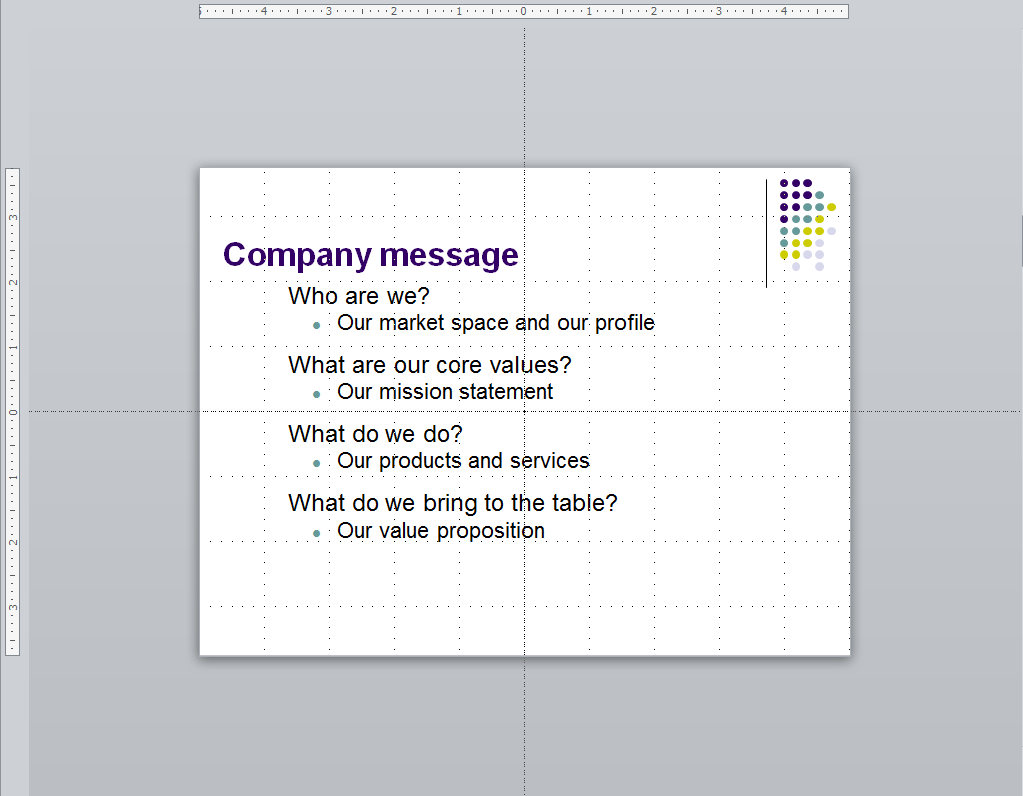
2. Use gridlines.
When designing a presentation, make sure to enable gridlines first. You’ll be able to line up your words and images so things won’t look so wonky. Just right-click on the slides and select “Ruler” and “Grid and Guides” to turn them on (For Grid and Guides, choose the “Display grid on screen” checkbox.).

3. Use simple animation.
I hate it when speakers go overboard with animation. This is not a Pixar movie – it’s a business presentation. However, I do like to choose animation that allows me to ‘fly in’ each text box as I need it, when I click. Nothing elaborate. I do this to minimize the amount of text on my slide until I need it and to prevent my audience from reading ahead and becoming confused. But doing this requires that you know what’s on your slides and how the information is organized so that you know what’s coming next – that makes your presentation flow better.
4. Gifs are funnier than photos.
I’ve learned this over time. Gifs, if you’re not familiar with them, are animated photos that can add life – and humor – to any presentation. Where possible, try to use them. You can find tons of them at Giphy or just by searching Google Images for “gifs” of a topic.
5. Borrow ideas.
I don’t like to use the pre-made templates that come with Microsoft Office and other presentation software. I find most of them overdone and oftentimes distracting. But I do think they serve a purpose – by reviewing a bunch you can get a lot of great ideas. You can also check out presentations posted to Slideshare for more good ideas. And you can “borrow” some of the graphics to cut and paste into your own presentation.)
You can use the ideas of others to create your own PowerPoint without having to reinvent the wheel, and you’ll have full control over the result.
6. Keep backups and use online.
Use DropBox, Google Drive or Microsoft OneDrive to save your PowerPoints online. This way, if you forget your laptop or need to make a change on the road, you can do so from any device. Thank you, cloud.
If you have PowerPoint it probably means you have Microsoft Office. And if you have Microsoft Office you probably have a Microsoft account. And if you have a Microsoft account then you definitely have free storage on Microsoft OneDrive. Use it. Whenever you finish a PowerPoint document, save it in the cloud. That way, you’ll be able to access it anywhere if you need to make any updates, edits or just copy it onto the laptop that the meeting planner is providing for you.
7. Go B&W.
No, you’re not going to a Black & White presentation. But you should get used to using the B and W keys during your presentation. The B makes your screen go black and the W makes your screen go white. Good presenters balance their PowerPoint data with their own words. People are there to see you speak, not to read. So speak. Blank out the screen after the information has been absorbed and focus your audience’s attention on the real star of the show: you.
8. Have no slides at all.
Think I’m kidding? The best presenters I know from the National Speaker’s Association do not use PowerPoints. The great ones on TedTalks use them very sparingly. They tell stories. They engage the audience. They talk about things that are way more interesting than what’s on a PowerPoint. If you are able to give a 30-45 minute presentation without using PowerPoint and still walk away with applause and great reviews, then you have officially made it as a speaker.
9. Take a nap.
You don’t need to be there to run your slide show. It can run by itself. All you need to do is setup as a “kiosk.” Go to Slide Show and then Setup Show and then select the “Kiosk show” – depending on the version of PowerPoint you’re using, it may say “Browsed at a kiosk” or use some other variation of “Kiosk show”. Then go to the Transitions menu and choose the timing for your slides to appear. When you run the show, everything will happen automatically. This is great if you have cool visuals and you just want to let it run behind you while you give your presentation. Or you can set it up to run on its own if you’ve got a trade show booth. No, you’re not really going to take a nap, but nice try.

